How to Achieve the Ideal White Paper Format
The white paper is a powerful tool that can complement the sales process in combination with case studies and other sales collateral as part of a larger marketing strategy.
Some of the key benefits of white papers include:
- Credibility: White papers are often written with an objective lens, backed by reliable resources.
- Lead Generation: As premium content, white papers offer enough value to gate and capture new contact information.
- Sales Support: The white paper in and of itself is designed to inform prospects in a problem-solution format. It helps prospects understand their problem, simplifies the technical stuff, and explains the solution without explicitly selling.
But how do you go about choosing the optimal white paper format for readers?
The Design Challenge
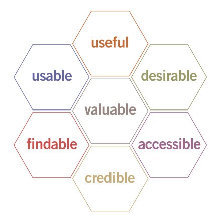
Peter Morville’s “User Experience” Honeycomb below can also be applied to content, not just UX design, (or, in this case, your white paper format).

Source: Semantic Studios
The information you offer in your white paper must be presented with these qualities in mind:
- Usable— Interface must be easy to consume
- Useful—The information must benefit the reader
- Desirable—Encourage audience appreciation with emotional design
- Findable—Should be easy for the user to find what they need
- Accessible—Must accommodate users regardless of prior knowledge and abilities
- Credible—Design influences reader trust and attribution of credibility
- Valuable— The whitepaper must be worth the investment of time and resources
In order to apply these principles to your white paper design, you need to understand how readers are changing in this digital era.
Here are some things you need to consider to choose the best white paper format for today's user.
Requirement #1: Responsive Design
As this report from comScore shows, people are increasingly choosing to consume digital media on mobile. Thus, the content experience needs to be effective across all the platforms readers might consume it.

Source: comScore
If you want your white paper PDF to look good on screens both big and small, it must feature carefully selected images, effective text and sensible layout hierarchy that considers possible viewing environments.
Requirement #2: Making it Easy to Scan
"Scanning" is competing with "traditional reading". This second method of reading is the result of a saturation of content and a lack of time to consume it carefully.
A quick glance has to give the reader an accurate sense of the information on a page. For easy scanning you need to consider the details about the layout, choice of images, typography, and the consistency between header, subheads, and body text to deliver a quick preview.
Balancing Speed and Comprehension
According to one study that analyzed online articles with line lengths of 35, 55, 75 and 95 characters per line (CPL), users read fastest on articles with approximately 95 CPL.
Since this apparently has no bearing on comprehension, the optimal line length seems to be around 95 CPL.
It's interesting to note that readers apparently feel like they read fastest at 35 CPL but actually read slower because shorter lines mean more line breaks and more jumping around for the reader's eye.
As for comprehension, users preferred reading text with margins, and that it increased comprehension compared to text without margins - it puts less strain on the eyes and offers a more satisfying layout.
Since margin sizes and line lengths affect each other, users need a balance of the two for ideal reading speed and comprehension.
Typography
The best font choice usually comes down to the type of content, your intended audience, and tone of the overall narrative. But different classes of fonts have different innate levels of readability.
Serif fonts tend to look more "old-fashioned", but the serifs (the marks flowing at the points of the letters) lead the reader from one letter to the next for a smoother reading experience. However, this only works at high resolutions, such as physical media like print. At a low resolution with smaller sizes, the added complexity negatively affects letter recognition.
Sans-serif fonts simply lack the "serifs". They look more modern and are generally easier to read on a screen because the simplicity still translates well to lower resolutions.
For body text, Verdana is often believed to be the most effective font.
Requirement #3: Boost Engagement with Interactive Elements
Interactive white papers stand out and engage readers with a mix of media and clickable buttons.
Readers today can scroll, search, zoom, and click within white papers all with a fingertip. The overall experience you present can make use of this trend. With the right tools you can add elements such as video, slideshows, links and buttons to give your white paper an interactive format and incorporate other content.
Design according to the interactive elements of your whitepaper to deliver an engaging and differentiated content experience.
In order to adapt to the evolving needs of readers, it’s necessary to redefine the traditional formats of whitepapers beyond a simple educational PDF with a corporate design to something that can engage with prospects on multiple levels.
Summary
White papers are a steep investment of time and resources. In order to ensure your white paper is as valuable for your content marketing as you intend it to be, you need to choose the ideal white paper format:
- It must look good on any screen your audience consumes it on
- It needs to accommodate scanners as well as readers
- It needs to be engaging with interactive elements and other media
If you're in need of inspiration, check this out:
White papers still have a role in content marketing today. You just need to choose a format for them that accommodates tomorrow's audiences.
